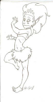
 A marked improvement from last week's work...
02 September 2008
01 September 2008
19 August 2008
09 July 2008
02 July 2008
Drawing Words - Writing Pictures: Chapter 1
Ok, this is going to be a long post with mediocre art (even by this blog's standards). Consider yourselves warned.
I bought Drawing Words & Writing Pictures after Bryan Lee O'Malley recommended it on his LiveJournal. It's essentially a textbook for making comics, complete with activities, assignments and homework.Unfortunately, I'm working through the book on my own (as a "Ronin") and seeing as there isn't a lot of material online for people like me, yet, I decided I might as well upload my work here (and, hopefully, draw some traffic in the process >:D).
Here we go.
Chapter 1
Activity: Drawing time
Part 1
Where I'm supposed to draw 5 moving objects from a list.

2. The car, considering my limited car-drawing abilities, turned out pretty good. It's leaning towards the front, slightly, and the wheels are distorted which works nicely. Perhaps I could have added a blurred background (like so) to give an even stronger sense of velocity.
3. There's some amazing examples of falling balls at the official site that make my attempt look plain lazy. Which, I guess, is true. Still, it is a ball, and it is falling.
4. My staggering person is where I failed completely, something also mirrored later in my tripping person. Maybe if there was more context and I used some emanata to get the message across. Drawing people in unbalanced positions is hard.
5. Finally, I'm quite happy with the newspaper. I guess I could've made its shape more wobbly, but I'm not sure if it'd still be recognizable. The little leaf is a nice touch that someone also used in the official examples.
Part 2
 I had some trouble with the composition for this one, struggling to fit everything inside the panel borders, but I managed pretty well in the end. Admittedly, it's not very clear that the dog is jumping into the panel -- The fact that I went against the "usual reading path" (right-to-left) gives the impression that he was already there. Flipping it around helps a lot:
 Ta-dah!
 I mentioned the tripping scene, earlier. I really could've done a better job at this. The only thing clear is that the first guy is laughing. The other guy looks like he's frozen in mid-air, rather than falling, and it doesn't "feel" like he actually hit the lamp. Oh well. The examples on the site aren't that great, either :P
 Now this is satisfying. Stick figures get the job done because they allow you to leave out any unnecessary details. Note the chandelier's ominous shadow. Perhaps I should have moved both figures a bit lower in the panel, so I'd have more space to show the chain being cut. Or, I could have just drawn the bullet leaving the frame.
Homework: Drawing in Action
Where I'm supposed to draw a scenario of my own.
I thought my first attempt wasn't "action-ey" enough, seeing as it lacked speed lines, so I drew this, instead:
 Which is, well, fairly straightforward. The eggbox looks awful, though.
Checking the examples made me realize my first attempt (which I like better) was just fine, though, so here's that, as well:
 It's hard to get a peaceful breakfast around here.
I'm just not sure how obvious it is that Dracula is appearing out of thin air to scare him.
Hm... These are a lot harder to critique than the ones with a specific goal.
Final Thoughts:
I think I better understand the importance of getting a crystal-clear message across, now, as well as the fact that these "tricks" definitely have their place.
01 July 2008
how about a bouquet?
30 June 2008
full moon
26 June 2008
25 June 2008
Subscribe to:
Comments (Atom)


